Unity Ziva Face Trainer Redesign
A redesigned cloud application to simplify high-fidelity
auto-rigging for character creation.
Role: Lead designer
Responsibilities: UX design, user research, UI design, workflow diagramming, user story mapping, interaction design, prototyping
Other team members: 1 product manager, 1 front-end engineer, 4 back-end engineers, 1 QA, 1 technical artist, 1 technical writer
Context
In January 2022, Unity acquired Ziva Dynamics, a leader in visual effects, animation, and gaming software, to build a character tools division.
A year later, I joined Unity as the User Experience Designer for Unity Ziva Face Trainer.
The Ziva Dynamics teams were new to working with UX designers so my first project at Unity presented an opportunity to collaborate on creating new ways of working while streamlining how users interact with Face Trainer.
Overview
Face Trainer is a cloud application that uses machine learning to convert, train, users’ human and creature face meshes into dynamically expressive face rigs called Ziva Faces.
Note: In character and creature pipelines, Face Trainer is used after a 3D character artist uses modelling software of their choice (e.g., Maya, Blender, etc.) to create a static face mesh.
When I joined, Face Trainer was still in its beta phase and one of the main business goals was to prepare it for general availability with a launch on the Unity.com website.
So that new users could easily align their goals with Face Trainer and use it right away, this redesign focused on:
assessing and simplifying the whole user experience
reducing barriers to entry
preparing Face Trainer to transition from its beta phase to general availability
My First Experience
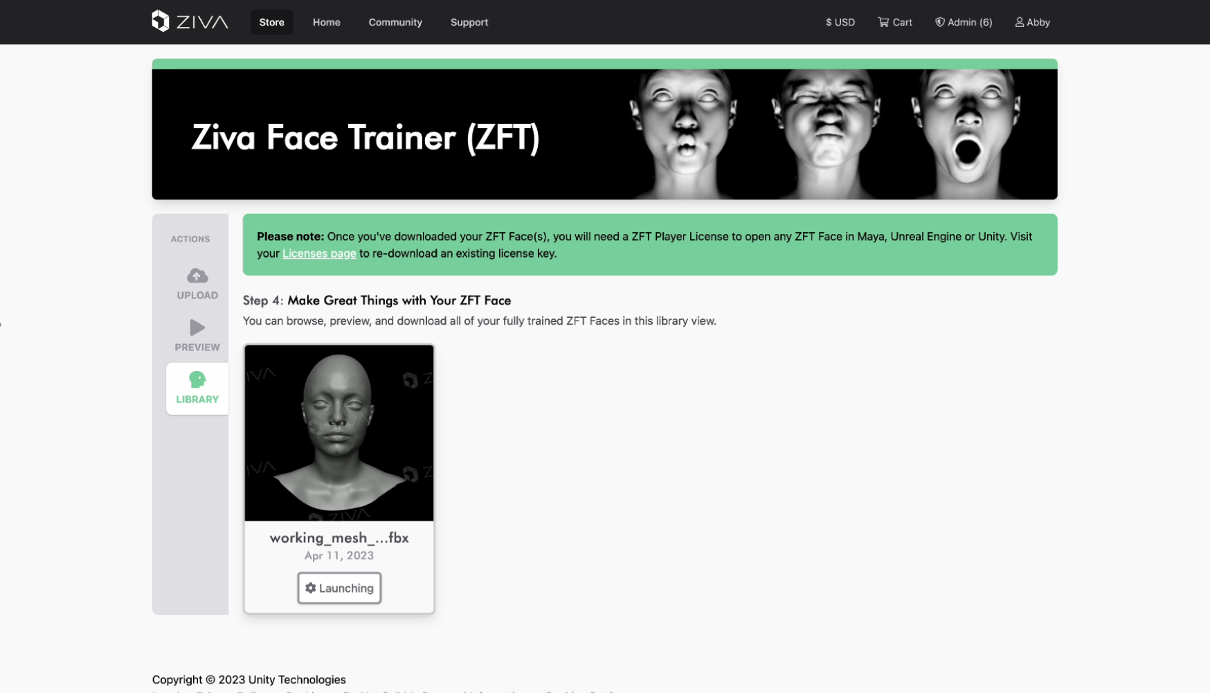
The first thing I did was try Face Trainer to see what its first-time experience was like. Using internal test files, I went through the happy path workflow for training a face mesh into a Ziva Face. Conversely, I ran files that intentionally exposed issues to examine error states users may encounter.
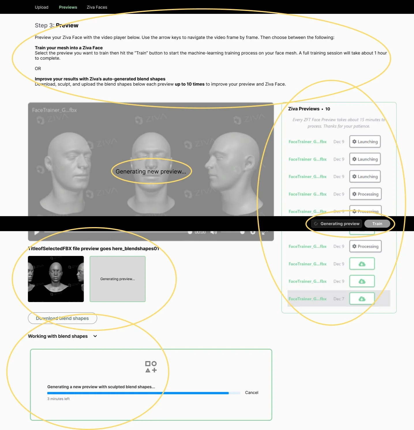
Face Trainer Before My Redesign
First Impressions
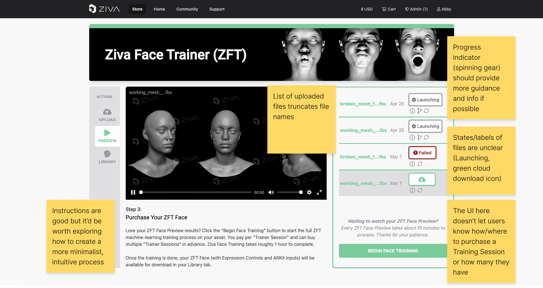
As I went through Face Trainer workflows, I took screenshots of various parts of the user interface and added notes for later review and categorization.
Themes for UX opportunities started to emerge such as:
increasing timely and appropriate feedback
simplifying content and visual design to focus on the user’s primary goals
adding ways for users to have more control over specific actions
Then, I completed a workflow diagram (without run-ins with errors) to document Face Trainer’s current state (February 2023).
Interviewing Users
Since I don’t have experience as a 3D artist, I needed to speak with actual end-users and learn about their experiences with Face Trainer. With no access to external users, I interviewed 7 internal artists with varying ranges of experience with 3D software - from 3D generalists to 3D technical directors.
Using open-ended questions, I wanted to learn about three main things:
Each user’s current Face Trainer experience
Each user’s blue sky/ideal Face Trainer experience
The gaps between the two
In general, all 7 users noted a lack of intuition with the current app, with a desire to have a better guided experience between all 4 main steps (upload, view preview, train, and download).
“I’d prefer a step-by-step, guided layout where I can choose 'next' when I’m ready to move on.”
— 3D Generalist, Technical Artist
“I want clearer instructions on how to fix errors that my uploaded file runs into.”
— 3D Specialist, Senior Technical Director
“New users need to know where to buy Training Sessions - it’s not explicit enough in the app.”
— 3D Generalist, Technical Aritist
Based on this user feedback, I updated my workflow diagram to include pain points that emphasized the amount of friction between each of Face Trainer’s 4 main steps.
Using Heuristics to Frame Principles and User Needs
Next, I needed to narrow down specific areas of improvement. I mapped my learnings from my first time experience and user interviews onto Jakob Nielsen’s 10 usability heuristics and came up with 3 guiding principles:
Keep users informed and provide timely feedback at each step
Heuristic: Visibility of system status
Provide a versatile experience for both novice and expert users
Heuristic: Flexibility and efficiency of use
Improve error messages with constructive feedback
Heuristic: Help users recognize, diagnose, and recover from errors
These principles shaped our target user persona and an 8-step north star workflow consisting of user needs statements that I logged as design tickets for project management.
North Star Workflow - Balancing First-Timers and Experienced Users
The key persona for the redesign is a first-time user with general 3D experience since the process to use Face Trainer is the same each time. Use it once and you’ll know how to use it next time and the next and the next.
Prepare Face Mesh
As a first-time user, I want a way to quickly prepare a face to run through Face Trainer.
Upload
As a first-time user, I need a clear way to upload my face mesh and a way to view errors with guidance on how to fix them.
Preview
As a first-time user, I want to track the progress of a face generating a preview.
As a first-time user, I need a high-fidelity representation preview of what the trained face will look like so that I can decide whether or not I need to fix my face mesh or commit to purchasing a Training Session.
As a first-time user, I need to know if my upload will encounter errors during face training, what these errors are, and how to fix them.
Fix (optional)
As a first-time user that is dissatisfied with the results of the preview video, I need guidance on how to fix my face mesh.
Train
As a first-time user, I want to track the progress of a face in training.
Preview
As a first-time user, I want to preview my fully trained face before downloading it.
Download
As a first-time user, I need to load my fully trained face in a compatible digital content creation (DCC) software (Maya, Unity, Unreal).
Identifying Analogies and Sparking Ideas
One of my favourite parts of ideation is exploring products in different industries for analogies to the product I’m working on. This helps me stay close to user problems without getting caught up in technical details.
Although Face Trainer’s role sits in a complex character pipeline between modelling and rigging for 3D character artists, strip it to its core and it could be likened to a file converter:
Users upload a specific file format (.fbx), press Train and, in approximately an hour, can download a Ziva Face - a trained, “converted”, file with added capabilities in a new file extension type (.zif).
So, in exploring UX interactions for a Face Trainer redesign, I found myself studying a variety of products for 3 main parts of the Face Trainer experience:
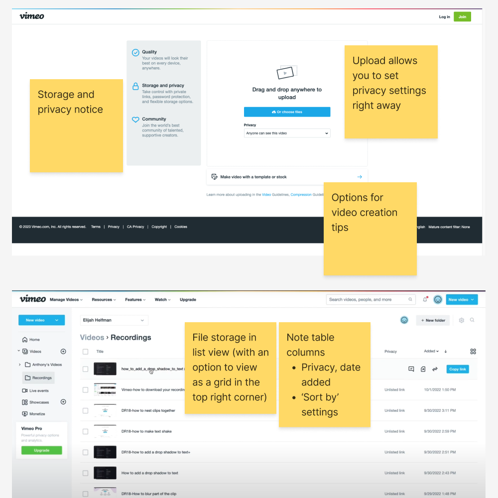
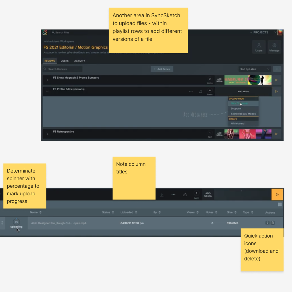
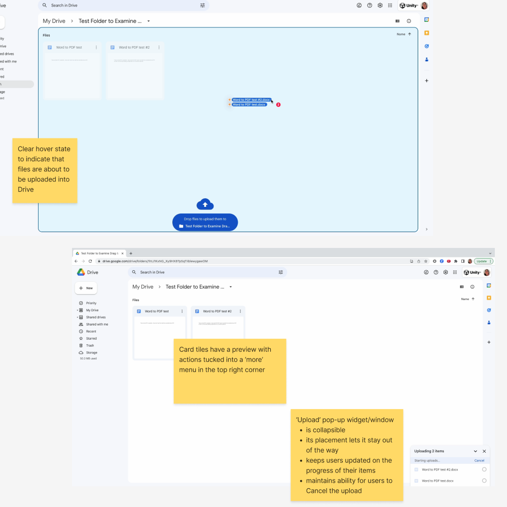
Upload: Face Trainer relies on a file upload as a user’s first step so I looked at smooth upload experiences.
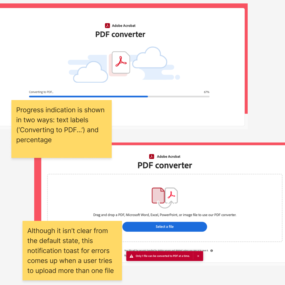
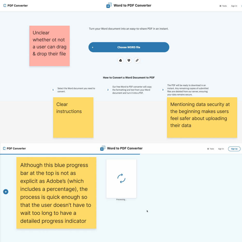
Vimeo, Google Drive, SyncSketch, Word to PDF Converter, Adobe Acrobat PDF Converter
Store: Once a file is uploaded and generates a video preview, it’s stored in Face Trainer. I turned to online file storage solutions and platforms that rely on file storage.
Google Drive, YouTube, Vimeo
Play: Before users commit to a Training Session, they can play a preview video to see what their Ziva Face will look like. I reviewed online video players.
YouTube, Vimeo, Google Drive
Snippets of Product Reviews with Annotations
Working with Limitations
Before I started designing, I noted limitations I had to work with, including:
Redesigning within the confines of the Ziva Store: Due to limited time and human resources (I was working with 1 front-end engineer), the new version of Face Trainer still had to live under the Ziva Store (store.zivadynamics.com) with a future version having its own dedicated .com site.
For this redesign, ways to distinguish Ziva Face Trainer from the Store could include a sub-site of the Store with a clearer global navigation bar
Using the current upload widget (FilePond by PQINA): Keep the third-party upload component to reduce development time but make changes where possible to make visual design cohesive and improve user feedback.
Combining existing Ziva colours and Unity colours: At the time, the Unity character tools division was working on its own design system and it was recommended to maintain Ziva colours while integrating key Unity colours, such as the Unity blue and red (for error states).
Design Iterations
Starting Page: Simplify how users start with clear options and reduced noise
The main focus of the starting page is for users to upload their FBX mesh file so these iterations focused on emphasizing this call to action while still giving users access to links and info they might need to set up (Face Preparation instructions). Feedback was collected from the aforementioned 7 internal users throughout the design process via 1:1 interviews.
The information architecture of this layout was oversimplified to the point where users felt something was missing and the flow was disconnected. While the tabs at the top were reduced to two by introducing a table underneath the upload area where uploaded files would appear for previews, users did not know what to expect between the upload area and the previews table below it.
This version has a new link at the top (Download the Face Preparation Kit) which was a decision made after working with the technical writer on updated documentation. To improve clarity between the steps, there are separate page headings for ‘Prepare and Upload’ and ‘Previews’.
Preview Video and Training Page: Provide users with focused viewing and a guided training session
After uploading their face mesh file, users can watch a preview video to see what the face will look like as a trained Ziva Face. Users can then assess the accuracy of their uploaded face as it runs through multiple facial expressions in the preview video. If users are satisfied, they can commit to a Training Session.
Here, it was important for users to understand the purpose of the preview page right away with a focused view of the video to enable decision making for a Training Session.
This iteration played mostly with layout. When showed to users, instructions were either skipped or skimmed too quickly and users focused on wanting to understand how to use blend shapes and receive updates on their generating preview video.
This two-tab version emphasized the video and an optional corrective shapes workflow by simplifying components, reducing text, and reorganizing the layout. Train is the primary action here with an accessible way for users to purchase Training Sessions in the top right corner. Users appreciated the simple instructions for corrective shapes and the ability to review Preview Versions before committing to a Training Session.
Note: Blend shapes (later named corrective shapes) was ultimately removed from the product as a business decision.
After blend / corrective shapes was removed as a feature for the release, the main goal for this page became more singular. Users only had to decide between training their file or not and downloading the preview video for sharing and review with others.
Ziva Faces Page: Define how users download their trained Ziva Face and learn about next steps
The first iterations for the Ziva Faces page are very similar to the Library tab in the original Face Trainer interface. The main action continues to be downloading the trained Ziva Face (green cloud download icon) with an option to download the same Preview Video (film icon) from the Previews tab.
Downloading the trained Ziva Face was clear to all users however, in both, it was unclear that the film icon was to download the same Preview Video from the Previews tab. Users assumed this was a new Preview Video - an updated one based on the Training Session to reflect what the trained Ziva Face would look like when opened in their software of choice.
This iteration was too text-heavy which overloaded users. It also still relied on the tab structure for users to navigate from Upload to Previews to Ziva Faces which did not solve the need for more guidance between each step.
Blue Sky Design
In addition to the iterations above, I did a “Blue Sky Design” to drastically re-envision what Face Trainer could look like as its own application, separate from the Ziva Store. I took big inspiration from the simplicity of Google Drive whose minimalist and intuitive design is largely because of various interaction states and progress indicators which make it easy to go from step to step. This layout also allows for greater scalability, with a menu structure on the left leaving room for additional features that were being discussed at the time.
Final Redesign
The final released design (July 2023) ended up being a combination of the iterations above with some of the Blue Sky Design components. This allowed me to direct users’ attention to the progress on the page instead of relying on tabs to navigate between upload, preview, train, and download steps.
Note: The 8 screens below in the carousel are main snapshots of what users experience throughout Face Trainer. Other interaction and error states are not shown.
Component Close-ups
The new slide-out upload component integrates the third-party upload component, FilePond by PQINA, with tweaks to its UI for visual cohesion with the rest of the redesign. Users can minimize the component by clicking on the down arrow in the top-right corner during an upload. Users can also access the Face Preparation Kit and Face Preparation Instructions through the links underneath the heading.
The Previews table includes a Status column where users can track the progress of their Preview Video or Training Session.
While my initial designs recommended including a time estimate for both progress bars (generating a Preview Video can take around 15 minutes while a Training Session can run around 60 minutes), limits to development resources meant we could only provide users with text labels as markers of progress.
If users encounter an error during either stage, they can click on the diamond error icon to view a dialog box containing info they could use to fix the error.
User Reactions
“Whoa, I think it’s a great improvement. Slick and easier to follow. I like that I can see how many Training Sessions I have.”
— 3D Generalist, Technical Artist
“I love the upload experience. I also appreciate that it’s explicit that I can leave the page during the long bits instead of waiting around.”
— 3D Specialist, Senior Technical Director


